Sunday, January 21, 2007

Collage a Kitchen Backsplash Using Resin

This is going to take all of you in a whole new direction, train of thought, forward idea of what you can do. Your options are endless on this one. That is why I love it so much. By the way, remember the glass tile blog? If you couldn't afford to tile your entire backsplash, how about this technique?...add some tile and GO!

I am including the links you'll need to watch the video and to cruise HGTV's site. click on the word "comments" at the bottom of this entry if you have any questions, comments, etc. You'll see a small image of an envelope next to the word. Thanks!

This is definitely something you should press the PRINT button for......here goes

Embed your favorite household objects in a backsplash of clear resin to create a wow-worthy 3-D collage.
http://design.hgtv.com/kitchen/Video_detail.aspx?id=790 Click here for the Video


Step by Step Instructions
Materials List:large sheets of paper or cardboard to use as a template


silverware or other small household objects(sea shells, key collection, broken bits of pottery,etc)

resin and catalyst (available at art supply stores)

1/4" lauan plywood to fit the footprint of your backsplash (available at lumber companies)

colored laminate to fit the footprint of your backsplash -I am including some examples and a link for laminates at the bottom of the page

http://www.countertop.com/products/listcategoriesandproducts.asp?idcategory=28&curPage=1&View=All


1" x 2"s to create the form

nails

drinking straws to hold the space for your mounting hardware (how many will depend on the size of your backsplash)

1 can of cooking spray

finish screws and grommets

construction adhesive

Tools:
pencil with eraser
measuring tape
jigsaw

Step by Step:
1. Measure the dimensions of your backsplash. Using a large sheet of paper or cardboard, transfer the measurements to the paper, then use scissors to cut a template. Set the template in place and tweak it until it fits the backsplash area perfectly.

2. Lay the template over the lauan plywood and transfer the measurements. Use the jigsaw to cut out a footprint of your backsplash from the lauan. Use safety precautions when cutting the plywood.

3. To add a dash of color, layer a piece of laminate over the plywood (we used bright red). Using the same template, transfer the footprint of the backsplash onto the laminate then cut the laminate with the saw, exercising safety precautions. Lay the laminate over the plywood.

4. Nail together the 1" x 2"s create a frame around your backsplash's footprint so your resin will have a place to pool.

5. Since this is a heavy project, we recommend securing the backsplash into the wall studs. Find them with a stud finder (available at hardware stores), then mark the measurements on the laminate.

6. Drill holes where you will put your mounting hardware, then insert clear drinking straws upright in the holes. As you pour the resin, it will dry around the straws, giving you a channel through which you can easily insert your hardware.

7. Spray the form with cooking spray to make it easier to remove the backsplash.

8. Wearing safety gear and working in a well-ventilated area, measure out the resin and add the hardening catalyst. Mix thoroughly according to the manufacturer’s directions.

9. Fill the mold about one-third full, then wait about 25 minutes to let it harden to a jelly-like consistency.

10. Place the silverware or other objects in the resin. (sea shells, glass tile, etc)

11. Pour a second layer of resin, repeating the same process as for the first. Don’t overfill the mold. In all, our mold took three layers of resin to complete.

12. Let the mold cure for 24 hours. The mold should make a clicking sound when tapped and should not be tacky to the touch. Remove the form.

13. Apply construction adhesive to the back of your resin backsplash according to the manufacturer's instructions. Put the backsplash in place.

14. Install the finish screws and grommets in the holes created by straws.


The link for the Wilsonart laminates. There are hundreds of laminate options these days. Don't limit yourself!
http://www.countertop.com/products/listcategoriesandproducts.asp?idcategory=28&curPage=1&View=All

Have fun with your laminate too. Make it coordinate with the theme of your collection...here are a few examples. The burlwood look below would be great for the background of miniature cast iron kitchen utensils etc. The green would be fabulous for and antique(reproductions ofcourse) skeleton key collection. the yellow could work with some "neon" colored spatulas and things of that nature. The blue could represent the ocean in a seashell collection. Use your imagination. Find inspiration in the items you love to collect.


Monday, January 15, 2007

Before and After - Revisited


before.....................


after.


I thought this might be a great follow up for the "Before and After" blog. I am going to share some before and afters that you haven't seen and then I am going to walk you through the process and hopefully enable you to get busy with your own accessorizing. The inspiration for this came when my Mother in Law, Eileen emailed me and was excited about being able to use her own things in her accessorizing. Her voiced observation was that she hoped she had the "eye". Maybe I can simplify the process and help you all develop your own "Eye" Let me know after this blog what you think.


before...


after.


before...


after.


Now, the close up and the dissection....keep up boys and girls, we're walking....we're walking....
Sorry old joke (from the movie Dave).

The key here is Odd numbers. 3's and 5's
Do you see it? After settling this idea in your mind you need to remember that the eye responds to dimension. To create dimension you need varying heights and varying "textures". Greenery is the best textural element you can add to a vignette. Am I making sense yet? Lets focus on the vignette on the left. Here we used 3 elements. A vase, a bowl of fruit and a draping ivy arrangement with a touch of color. The "peak" or highest point of this vignette is in the center. So, your eye will naturally follow the lines without suffering from vertigo. If the height of your items went up and down, up and down, up and down in your vignette the eye would not be able to follow it with ease. Hence, the vertigo. Keep it easy on the eye. Keep your peak on the outside with shorter elements naturally flowing tallest to shortest or place your tallest element in the center and keep the sides lower in height but mirroring each other in the lower height.

Now, the vignette to the right is slightly different.

Here we have taken our tallest element and placed it on the outer edge. 5 elements are usually needed for this to be pulled off properly. This will be a larger vignette. The angle in which the photo was taken is slightly deceptive. Our tallest element here is actually the plate on the easel. then it drops down slightly with the greenery...and again drops down one more time with the tipped vase. Why tip the vase? well, because we can. It gave me dimension, color, shape and whimsy all in one piece. Who says that every single thing you use has to be upright? Why does it have to be so serious? Keep it simple. The Drapes featured at the beginning are a great example of keeping it simple, they were much busier looking before we reigned them in and tied them up. Have fun with this.


Just as important as the odd number rule, keep it all very tight. Let the items overlap each other. There is your depth. Do you see how all of the elements are touching in some way or other? That is important because it draws your eye to what you have deemed worthy or "important".
I realize all of the greenery I am showing you in these close ups is very similar. Well, they are all in the same home and within close proximity of each other. You need continuity. Items have to compliment each other in some way. I would never put a Flour canister with gilded plates on a China Curio. I would however put a Flour canister with a basket of "bread" (you can find fake or polyurethane real) together. It makes sense and they compliment each other. This display really took the curio to the next level and it helped to close up the empty space above the curio.
I use a lot of easels in my displays.Again, it's great for depth. I can bring otherwise flat objects up and into view. Somehow I don't think the plate would have the same effect if it were just "sitting" on top of the curio. You can also use easels to prop art into a vignette. A great way to get art off the wall and give your framed art dimension it otherwise would never have.


If I need to clarify anything or expound on what I have shared here please click on the word "comments" and I'll be happy to help. Thanks for your time!
Diana

Sunday, January 14, 2007

Before and After


Hello Ladies and Gents,
Today I want to talk to all of you about "Before and Afters". What I mean by that is I want to show you a couple of rooms/areas before they were accessorized and after they were accessorized. For you Non- Believers out there I hope you'll be a convert when I am done.

Accessorizing is a lot more than simply displaying your wares. It is really more like "merchandising" your precious belongings. For Instance, The cabinet to the left is definitely displaying this homeowner's belongings. Everything in the cabinet is really quite lovely. But, what are they doing for the cabinet itself? What are they doing for the finished effect of this home? Well, "They are on display." you say. "Isn't that enough?" My answer....No. It's not enough. Now I am going to take you down to the cabinet after it is properly accessorized...


Here is the same cabinet, refitted with the items our homeowner already owned. What we did here was rejuggle her things. One of the vases came out from inside the cabinet and now is on display up on top. What a difference. Wow. The chest you see next to the vase was sitting on top of the refrigerator doing absolutely nothing except looking like it was there for lack of any other place to go. Now it is an important piece in the scheme. In addition we added some greenery with just a touch of color to warm up the little vignette. To the left of the cabinet we hung a plate rack that had been sitting in a closet. Wow again. The cabinet is holding just as much as it was before we started but it is actually working more as a place of importance now rather than merely a place to store things.


I know you have all seen this room before. I use it as a teaser on my Blog. Well, this is the room after it was furnished. The major thing it is lacking is the "dressing" what I like to call, "The bow on the package". Yes, the furniture is gorgeous and the room looks really nice. The client has already hung her Thomas Kincaid and placed a couple of family pictures on the mantle. That's enough isn't it?

What do you think? There really is plenty of lighting in this room with all of the recessed lighting in the ceiling. The fireplace tools seem like a nice homey touch. With all of that beautiful furniture why would you want to distract from it? Well, you don't want to distract from it. You want to enhance it. You want to warm the room up and rid it of it's sterility. That is what a good accessory installation can do for you.


I am going to take you to the After shot now. You decide. Accessorizing doesn't mean it has to be cluttered, Not if it is done properly. Actually, when you have a good accessory installation done, it will never appear cluttered but warm and clean. We added a lamp next to the sofa, a floral arrangement on the table and a light assortment of accessories on the built in shelves and mantle. Now I feel like the room is an invitation rather than a display. What do you think?


Here are a few more before and afters...

Before.......................... After


What we accomplished here with just two tiebacks was a cleaner and less busy look. We simplified the 2 windows by dressing them. Instead of 2 panels per window we pulled the pair of panels on each window together to create the illusion of a single panel and joined them in the corner. We wanted to keep the fullness accomplished by two panels per window and decided removing a panel would take away from the overall appeal. The tiebacks were well worth the investment.

The last Before and After I want you to see is a snapshot of the room featured at the bottom of the blog. Here is the before. The photo at the bottom of the blog is it's After. What you see here is the room before we accessorized it. Not a bad looking room like it is. After we accessorized it properly, it went from very nice to WOW.

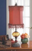
If you have the eye for accessorizing then I suggest you get busy. If you don't then interview a few designers in your area. See who is willing to work with you on creating the finishing touches on your home. Remember also, you do not have to go into a 2nd mortgage on your home to accomplish a great look. Decide on a price range before you hit the stores.
There may be a few pieces here and there that you'll just "have to have". Spend the money on them. You'll find that it was well worth it because those pieces are also going to be conversation pieces. Otherwise, look in the places you least expect. Old Time Pottery, Kirklands, Dockside, clearance rooms at furniture stores. Spend wisely not frivolously. Take digital pictures of each space you need to attend to. Bring the camera with you when you go shopping so that what you purchase is already placed. This will cut down on returns and spontaneous purchases. Don't be afraid to hire a designer to go shopping with. Yes, you'll spend money on their services but you'll save a Ton of money in the end result. As Nike says, Just Do It.
If you have any questions on this blog please click on the word "comments" and enter your question. I'll be happy to reply. If you have some ideas to add to what I have just shared, please do so.
Thanks so much for your time.
Diana

Tuesday, January 2, 2007

BIG Ideas for Small Bath Budgets by Chuck Ross


Hi all, This is an excerpt from HGTV's DIY series online. You'll find the link below.


Big Ideas for Small Bath Budgets
Getting the biggest bang for the remodeling buck.


By Chuck Ross
December 11, 2006/Bathroom remodelers come across them all the time — clients with champagne dreams and jug-wine budgets. Design magazines have given them lots of renovation ideas, but they're shocked when they see just how much all those features add to their project's bottom line. However, designer Jamie Gibbs says that, with a little creative planning, building pros can still give these customers unique spaces that don't break the bank.
Gibbs' New York City-based firm, Jamie Gibbs & Associates, has worked its high-end magic in homes across the United States and abroad. He's also a frequent speaker at industry events, including October's Remodeling Show, held in Chicago. He has a number of tips for remodelers interested in creating similarly stylish spaces at more down-to-earth prices.

Fear the fads First off, Gibbs suggests builders urge caution on fad-conscious clients. "Don't read trend articles," he advises. Instead, to ensure today's bath decisions still look current a few years from now, he suggests aiming for a middle road between traditional and contemporary, which he terms "transitional." This approach provides a cleaner look than classic period styles, without looking cold or clinical.
Second, he says, maintaining consistent metal finishes across all faucets and accessories is a must when aiming upscale, though the components don't all have to be from the same product line. In fact, you may have to pick and choose among a range of offerings, he notes, to find products of the right size and scale for each plumbing fixture. And don't feel you need to drop extra dollars for the latest antiqued metal looks. Gibbs says younger homeowners are finding retro appeal in classic and affordable chrome faucets and accessories.

Targeted spending Working successfully with a tighter budget requires a strategic approach, Gibbs continues. Don't worry if you can't afford top of the line across the board. Instead, save discretionary spending for those key features that will pay off handsomely in added style and comfort — and in increased interest from future buyers. These include:
Mirrors. "Space, or at least the illusion thereof," is the ultimate luxury when it comes to bath design, Gibbs says. Providing a mirrored wall — not just a small medicine cabinet — over a vanity can add virtual square feet to even the smallest room.
Lighting. Providing varied lighting options is one of the keystones of high-end designs. To create illuminating variety in less expensive spaces, Gibbs suggests adding a ledge of crown molding just below the ceiling to house flexible tube lighting, which can be used on its own as a night light or be combined with mirror and ceiling fixtures to develop a balanced lighting scheme. Similarly, under-cabinet lighting could be mounted on the bottom side of a wall hung medicine cabinet to brighten sink spaces. Finally, consider an upgraded ceiling fixture with an added heat lamp for real spa-like luxury.
Showerheads. "Spend your bucks on a good showerhead," Gibbs urges. "That's what people will notice." Distinctive rain-jet showerheads, for example, can create a big visual impact and feel great. However, he warns against spending a lot of money on expensive fixtures before ensuring the homeowner's water won't gunk up the works. Hard water, especially untreated well water, can leave behind flow-blocking deposits, so Gibbs suggests investing in a treatment system first when water quality is questionable.
Radiant heating. If flooring is being replaced, Gibbs suggests considering a hydronic or electric radiant floor-heating system. "It's relatively inexpensive and it feels luxurious to the feet," he says. Similarly, radiant towel heaters can warm the surrounding bathroom space as well as the towels. Both approaches, especially when installed separately from a home's overall heating plan, also can help keep a lid on energy costs by providing heat only where it's needed.

As a "side note" of sorts...

I am going to throw in some notes here for you to consider- if you cannot afford a mirrored wall or simply think it is too much then consider one of these two options:

For an existing mirror that is already glued onto the wall simply frame it with Moulding. Moulding is a great way to "frame" it and create a very inexpensive (approximately $20) yet custom look. If you like this idea please post a comment and I will be happy to instruct you on this option. The mirror I am showing to the left is a ready made mirror. You can duplicate it with nothing more than Moulding from a home improvement store, brass tacks, paint and liquid nails. The home improvement store will cut the wood for you usually for a very small charge (.25 cents - .35 cents per cut). If you want the short cut, post a comment and I'll quote you the price plus shipping for the ready made version...which leads me to the 2nd option.


The second option is purchasing a Framed Mirror to hang above the vanity. You can find beautiful and inexpensive mirrors in a variety of places. Decide on your price range and focus on stores that may offer you a variety of styles and price ranges. Look in the Bargain Basement rooms of large furniture stores. Look in second hand and consignment stores. Places like TJ Max, Marshalls, Home Goods, etc. This mirror is a great style for someone looking for a more contemporary style. Keep in mind, your options are only limited to what you can imagine. I have a beautiful wrought iron framed mirror in my hall bath and the most casually elegant shabby chic mirror you could imagine in my guest room bath. Quite different from each other but absolutely positively perfect.


I also want to throw some ideas that are "out of the box" for lighting in your bath. Don't think typical bath lighting. Look at chandeliers. Look at pendants, who says you can only have one light fixture per vanity? Not me.Why not a pair of small chandeliers flanking each side of the vanity? Think of something creative and show stopping over the master tub. Wow, talk about sexy, talk about romantic. All of you "non-bath taking" folks may find you're back into a nice hot tub of sudsy water if you love where you bathe...luxury without spending a fortune. Wow, who would have thought it possible. I LOVE the chandelier to the left here. I am considering this one for over my Master Tub. I love a good book by candlelight in a hot sudsy bath. I know, Stephen King isn't very sexy reading but what a great yarn he weaves.
On a different note how about an antique or antique reproduction coat rack in lieu of towel rods. What do you think of this one? I love the fact that it is unexpected and has an antique appeal. You can modernize it with a more contemporary style or you can paint this one in a bright chrome finish.


Need a shelf in the bath? A place for those candles or a make-up/jewelry box shelf? Think about something along the lines of what we are featuring on the left. FABULOUS! My girlfriend Suzi used a modified version of this in her bath and it's one of her favorite "rooms" in the house. By the way, If anyone is looking for a gorgeous Townhome in Gambrills Maryland, Suzi is looking for a buyer. I'll be at her home on Friday and I can't wait to see all of the DIY projects she has tackled in her home.


That's it for now. I hope you'll take away some great ideas that you can really be proud of in your DIY projects. Let me know if I can help, just click on "Comments" and I promise I will respond within 24 hours. Thanks for your time.


Diana

Monday, January 1, 2007


Happy New Year Everybody!!!!