Before and After - Revisited

before.....................
after.
I thought this might be a great follow up for the "Before and After" blog. I am going to share some before and afters that you haven't seen and then I am going to walk you through the process and hopefully enable you to get busy with your own accessorizing. The inspiration for this came when my Mother in Law, Eileen emailed me and was excited about being able to use her own things in her accessorizing. Her voiced observation was that she hoped she had the "eye". Maybe I can simplify the process and help you all develop your own "Eye" Let me know after this blog what you think.

after.


before...

after.
Now, the close up and the dissection....keep up boys and girls, we're walking....we're walking....
Sorry old joke (from the movie Dave).
The key here is Odd numbers. 3's and 5's
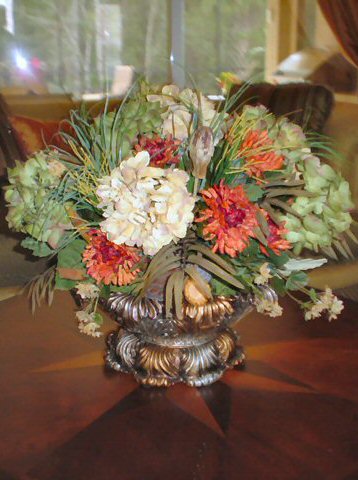
 Do you see it? After settling this idea in your mind you need to remember that the eye responds to dimension. To create dimension you need varying heights and varying "textures". Greenery is the best textural element you can add to a vignette. Am I making sense yet? Lets focus on the vignette on the left. Here we used 3 elements. A vase, a bowl of fruit and a draping ivy arrangement with a touch of color. The "peak" or highest point of this vignette is in the center. So, your eye will naturally follow the lines without suffering from vertigo. If the height of your items went up and down, up and down, up and down in your vignette the eye would not be able to follow it with ease. Hence, the vertigo. Keep it easy on the eye. Keep your peak on the outside with shorter elements naturally flowing tallest to shortest or place your tallest element in the center and keep the sides lower in height but mirroring each other in the lower height.
Now, the vignette to the right is slightly different.
Here we have taken our tallest element and placed it on the outer edge. 5 ele
 ments are usually needed for this to be pulled off properly. This will be a larger vignette. The angle in which the photo was taken is slightly deceptive. Our tallest element here is actually the plate on the easel. then it drops down slightly with the greenery...and again drops down one more time with the tipped vase. Why tip the vase? well, because we can. It gave me dimension, color, shape and whimsy all in one piece. Who says that every single thing you use has to be upright? Why does it have to be so serious? Keep it simple. The Drapes featured at the beginning are a great example of keeping it simple, they were much busier looking before we reigned them in and tied them up. Have fun with this.
Just as important as the odd number rule, keep it all very tight. Let the items overlap each other. There is your depth. Do you see how all of the elements are touching in so
 me way or other? That is important because it draws your eye to what you have deemed worthy or "important".
I realize all of the greenery I am showing you in these close ups is very similar. Well, they are all in the same home and within close proximity of each other. You need continuity. Items have to compliment each other in some way. I would never put a Flour canister with gilded plates on a China Curio. I would however put a Flour canister with a basket of "bread" (you can find fake or polyurethane real) together. It makes sense and they compliment each other. This display really took the curio to the next level and it helped to close up the empty space above the curio.
I use a lot of easels in my displays.Again, it's great for depth. I can bring otherwise flat objects up and into view. Somehow I don't think the plate would have the same effect if it were just "sitting" on top of the curio. You can also use easels to prop art into a vignette. A great way to get art off the wall and give your framed art dimension it otherwise would never have.
If I need to clarify anything or expound on what I have shared here please click on the word "comments" and I'll be happy to help. Thanks for your time!
Diana


No comments:
Post a Comment